:max_bytes(150000):strip_icc():format(jpeg)/Byr_OrangeNewBlack_SF-357a4b7863844ce081010e28464868e0.jpg)
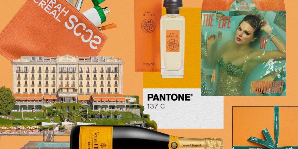
Call it the Taylor Swift effect, but orange has become a full-blown cultural movement practically overnight. Portofino Orange is the exact shade Swift has labeled the translucent orange on The Life of a Showgirl album (where she also notes it as “sweat and vanilla perfumed”—TBD if the vinyl pressing actually has a sweet and salty scent). While “Showgirl Orange” is likely to become ubiquitous and the statement shade of fall 2025, orange has always been omnipresent, with historic links to luxury status symbols. From Impressionist paintings and bold Lake Como awnings, to iconic signature-hued boxes and luxe bronzer packaging, orange you glad it exists?
Orange as a name for the color only emerged during the 16th century, says Kassia St. Clair in The Secret Lives of Color. Before that, English speakers used the cumbersome portmanteau “yellow-red” when describing the color. The hue has been consciously and subconsciously communicating with us (far before the 1500s, of course, and) ever since. Orange has been used to grab your attention—warning symbols on roads, urgent notices in emergencies, and even the Nickelodeon logo in the TV corner to instantly draw in any young viewer channel surfing—but it shockingly also has historic ties to every avenue of luxury.
The Artist’s Palette
In the art world, the Impressionists harnessed the power of the color orange. Claude Monet (Impression, Sunrise features a hypnotic bright orange sun), Edvard Munch, Eugène Henri Paul Gauguin, and Vincent van Gogh all used the notable color in their most prominent pieces. Fast forward to 1960, when Abstract Expressionist artist Mark Rothko created No. 210/No. 211 (Orange), which features two colors: purple and fiery orange.
When it comes to fashion, you’re likely to think of Hermès. Orange is so deeply entwined with the luxury design house, but that wasn’t always the case. “Prior to the Second World War, the company’s packaging was cream; it was wartime shortages that forced them to switch to mustard until, finally, they had no choice but to use the last paperboard color available: orange,” says St. Clair in The Secret Lives of Color. Hermès’ signature orange color, known as Orange H or Classic Orange, was born, and the rest is (spiced-orange colored) history. A few years later, the brand added touches of dark chocolate brown with the box trim and Bolduc ribbon, grounding and elevating the hue even more. What started as a necessity transformed into the greatest luxury marketing move of the 20th century.
In terms of wearing it, it’s not for the faint of heart. “It’s one of the most interesting colors in fashion, because people have such strong reactions to it,” says Kristen Bateman, author and founder of Dollchunk. While the modern quiet luxury movement is linked with neutrals and beige, long ago, the ultimate flex was bright colors, including orange. “Historically, before mass manufacturing, brighter colors were more expensive because they were costly to produce,” says Bateman. “Orange hues in clothing date back centuries, and many cultures see the color as sacred,” she adds.
Veuve Clicquot / Tremezzo / Pantone / Byrdie
Centuries of Luxury
Care for a drink? Take a sip of Veuve Clicquot and its famously distinctive orange label. So distinctive that the LVMH-owned brand has trademarked the specific orange hue. (Although the brand endured a very lengthy process to prove its signature shade of Pantone 137C was distinctive enough to register as a trademark.)
While orange is linked with some of the most luxurious brands in the world, what is the color actually trying to communicate? International color expert Amy Wax thinks orange is universal—and a sleeper hit. “It is so appealing, it is youthful, spirited, it’s a feel-good color,” she says. Part of the appeal of orange is its versatility. “It’s a color that crosses that generation divide: it doesn’t feel out-of-date, it’s a more contemporary color for luxury today,” adds Wax. But it’s also timeless, and Wax argues that’s because of orange’s distinct range. “You can go with very subtle peaches and creams, or a brilliant orange that’s like happiness on steroids—energetic, creative, high-energy—or terracotta, rusts, and pumpkins, which are really luxurious,” she says. “It’s amazing that one color can cross all those areas and accomplish all that.”
On picturesque Lake Como, the dramatic mountain landscape and deep blue waters are legendary, but it is the color orange that has become synonymous with the luxurious locale. Arguably, thanks to the popularity of an Aperol Spritz, but also the 115-year-old Grand Hotel Tremezzo, where their saturated, vivid orange appears everywhere: the terrace awnings against the butter-yellow facade, artisanal stripes in the porcelain china while sipping your espresso, the towels, loungers, and umbrellas around the pools, the tote bags given to each guest, and even the historic crest. It is an orange love affair for the historic Grand Hotel. “For us, orange means enthusiasm, joy, and Italianità,” says Valentina De Santis, the CEO of Grand Hotel Tremezzo. The exact bright hue is a closely-guarded secret, one they’d like to consider as instantly recognizable as Tiffany Blue, Brat Green, and Barbie Pink, and was specifically chosen to hit a sweet spot: assertive yet love-struck, fierce yet flamboyant, forever in style but always up for a bit of mischief.
It’s Impact on Beauty
We know packaging for a product sets an immediate tone, and that couldn’t be more important than in the beauty industry. In the world of perfumery, the color orange conveys luxury for several compelling reasons. “First—and perhaps most iconic—is its association with heritage and status, epitomized by the unmistakable orange packaging of Hermès,” says Givaudan Marketing Director Tara Darlington. “Over time, this distinctive hue has become a visual shorthand for exclusivity and refined savoir-faire.”
In a crowded fragrance marketplace dominated by dark, muted tones, orange packaging makes an immediate statement. “And, closely tied to what could be considered “the new luxury” in today’s world, orange communicates happiness,” she adds. As Rodrigo Flores-Roux, vice president of perfumery at Givaudan, explains: “As we have seen over many years of research, the color orange and orange fruit notes in perfumery convey bliss, cleanliness, and a feeling of joy. The perfect example of this is Clinique Happy, a fragrance I created back in 1997,” adds Flores-Roux. “The packaging has an uplifting, vibrant hue of orange, and the scent itself includes top notes inspired by orange juice.” Perhaps the enduring appeal of this fragrance lies in that deep emotional connection. Now, more than ever, that sense of joy—the ability to elevate the spirit—represents the ultimate form of luxury.
Hermes / Pattern / Sulwhasoo / Sarah Creal Beauty / Brydie
Fresh Wave of Packaging
Newer beauty brands looking to make a mark are leaning into orange’s association with history and luxury, too. Take the namesake brand Sarah Creal, founded by longtime beauty industry product developer and brand builder Sarah Creal. Launched in mid-2024, Creal created custom colors for each product in their range, a task the co-founder and CEO has been involved with many times before during her 30 years of leading luxury brands (including Tom Ford, Bobbi Brown, and, most recently, Victoria Beckham Beauty). For her own brand, she aimed to strike a chord of luxurious, artisanal, joyous, and unexpected. “The tiniest shift in color changes the emotional impact,” says Creal. After several trials of literal paint mixing, Creal landed on a tangerine orange hue, which is present in their Brilliant Repair Shield tinted sunscreen, Just Like Paradise bronzer compact, and the Signature Pouch.
Or consider actress and activist Tracee Ellis Ross’s haircare brand Pattern and their newly released body care line with pleasing red-orange bottles. The brand describes the hue as “sweet tomato,” saying it’s not quite red nor orange and can be read as either. The deeply hydrating body scrub, wash, oil, cream, and lotion come in a warm amber scent and range between $32 and $36.
Orange is also in the DNA of Ami Colé, the beloved brand founded by Diarrha N’Diaye-Mbaye that tragically announced it is closing this fall. Inspired by Senegal and born in Harlem, the brand has an elegant, energetic, and polished tone of orange. It’s the tube of the Lash-Amplifying Mascara and the packaging on both the On Point Precision Brow Pencil and the Soft Shape Lip Liner. Additionally, the outer packaging for almost all products features the signature orange color, which feels as synonymous with the brand as the rosy brown shade Excellence in their viral Lip Treatment Oil.
Sulwhasso is not a new brand—it has been a beacon of Korean innovation for decades—but they have made an intentional shift in packaging recently. Within the last few years, the brand has embraced an earthy and meditative amber, expanding it to all elements of the packaging; words on the label, outer packaging, bags, and even the traditional Korean gift wrapping cloth, known as jihambo. The shade is meant to imply luxury and trust, while also having a subtle nod to soil, from which their heritage ingredient, ginseng, grows.
Meanwhile, emerging German skincare brand Auteur and their muted orange exterior packaging set the tone for its Definitive Collection. The warm amber shade with gold print is meant to evoke a sense of optimism and warmth, says Chief Brand Officer Erin Mihok. While more neutral colorways were originally considered, the eye-catching shade was eventually chosen to stand apart, much like the brand hopes their formulations will do, too. The pricing is also luxurious, like the $1190 Composition No. 1 Serum, which combines over 40 active ingredients into one concentrated treatment. But don’t read the book by its cover: “The packaging reflects the spirit rather than the literal science of the formulas,” says Mihok. While the anticipation is jovial and exciting, the science of the formulations is rare and precious to the brand.
Global Influences
Across the globe, orange can lean more sacred. In India, the vibrant orange-red shades of saffron (as seen on the national flag) symbolize courage and sacrifice. In China, both the fruit and its color are auspicious symbols of good fortune, warmth, and vitality. Marigolds and the color orange are deeply symbolic and traditional for Mexico, with ties to life and the welcoming of spirits with Día de los Muertos. “Orange is a much more varied portfolio, the more you look at it, the more you realize there are a lot of colors that fall in that orange family, which is why it can be elegant and formal and youthful and exuberant and creative and a happy color,” says Wax. Perhaps from that perspective, maybe orange can be whatever you want it to be, reflecting whomever we are at that point in our lives. Elegant, courageous, warm, symbolic, luxurious, or as joyful as we’d like to be. Or just a massive TS12 fan…

