

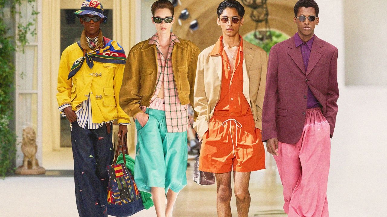
Similar can be said for the pool blue and navy pairings that popped up across collections including Auralee. “Wherever you use a dark color like the jacket against a brighter opposite, it’s the brighter color that the eye will go to first,” continues Eisman. “So now you’ve created two focal points: the shorts are the major piece because they take up more space, but you’ve got another connecting link at the neckline. It’s not just dark top, bright bottom; it’s a dark top accented with the same color family as the shorts, so the eye stops at the collar and the face, and then that color family is picked up again at another spot on the body.”
In contrast, Marc Jacobs made his “short, sharp shock of a show,” as Vogue’s Nicole Phelps described it, pop with some good ole fashioned color theory. For example, the greenish yellow mini dress and purple opaque tights work together because “they’re complementary colors: they’re opposite on the color wheel,” says Eisman. Instead of distracting from one another, they actually enhance. Plus, Jacobs’s sheer and shiny texture play entices the eye. “It keeps rewarding you with looking, as opposed to many things that are instant in our world today,” says FIT Professor and color specialist Jada Schumacher. She links the sudden influx of color to a new form of world building: Whether it’s interior design, a runway show, or your own closet, “it’s about the entire experience.” (Pantone highlighted an uptick in bright colors in broader product advertising as well.)
“In the past, color easily ‘defined you as a brand’ or qualified your designs as ‘on or off trend’ for the season,” explains Smilovic. “Brands were bright colored brands, or black austere brands. I think we don’t feel so limited by those labels now—sometimes we crave one thing or another and we figure out how to still speak in our voice.”
